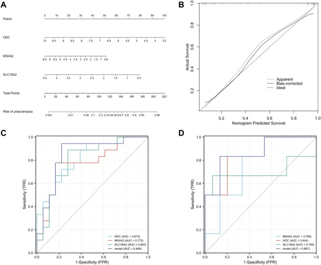
FIGURE 7.
Establishment of nomogram and model validation. (A) A nomogram was used to estimate the risk of preeclampsia in the training cohort. To calculate the probability of preeclampsia, draw a line perpendicular to the corresponding axis of each risk factor until it reaches the marked point of the score line at the top. The probability of preeclampsia can be indicated by summing the scores of all risk factors and then positioning it on the corresponding bottom line. (B) Calibration curve of training queue. The probability of the nomogram predicting preeclampsia is plotted on the x-axis; The actual probability of preeclampsia is plotted on the y-axis. The diagonal dotted line represents the perfect prediction of the ideal model. Solid lines represent the performance of nomographs. The closer this line is to the diagonal dotted line, the better the prediction effect is. (C) The ROC curves of HDC, MS4A2, SLC18A2, and model in the training cohort (GSE48424). (D) The ROC curves of HDC, MS4A2, SLC18A2, and model in the validation cohort (GSE149437).

