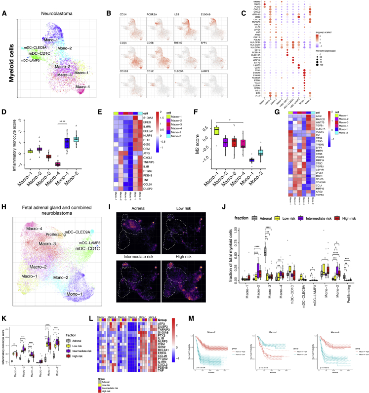
Figure 2.
Myeloid cell infiltration with distinct cell states detected in NB
(A–C) (A) Subcluster view of the myeloid cells as shown on a myeloid-specific joint embedding. Key marker gene expression shown in feature plots (B) and in a dotplot (C) for the different subpopulations of myeloid cells.
(D) Average expression of inflammatory monocyte score in different myeloid subpopulations (n = 16).
(E) Heatmap showing average expression of select genes from different categories (rows) across different cell populations.
(F and G) Similar to (Dand E), showing M2 score (n = 16) and representative M2 signature gene expression.
(H) UMAP showing combined myeloid cell integration (CONOS) including fetal adrenal and public NB single-cell data.
(I) Density plot comparing myeloid cells in fetal adrenal gland myeloid cells, and low-, intermediate-, and high-risk NB. Brighter color corresponds to a denser region.
(J) Cell fractions of different myeloid populations in fetal adrenal gland (n = 16), and low- (n = 5), intermediate- (n = 8), and high-risk (n = 21) disease.
(K) Inflammatory monocyte score for combined dataset comparing fetal adrenal gland (n = 16), and low- (n = 5), intermediate- (n = 8), and high-risk (n = 21) NB for different myeloid subpopulations. Statistical significance was assessed by Wilcoxon rank-sum test for (D, F, J, and K); ∗p < 0.05, ∗∗p < 0.01, ∗∗∗p < 0.001, ∗∗∗∗p < 0.0001.
(L) Heatmap showing average expression of select genes from different categories (rows) across different cell populations (top color bar, colors matching) (K).
(M) Similar to Figure 1E, survival curves for Mono-2, Macro-1, and Macro-4.

