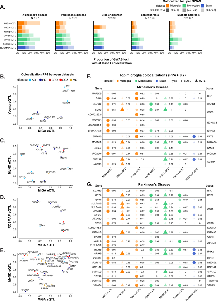
Figure 5. Summary of colocalization analyses.
A) The proportion of GWAS loci that have at least one colocalized gene in each QTL dataset. Fill opacity used to represent numbers of loci at different stringency levels for colocalization posterior probability H4 (PP4): 0.5–0.7 (lightest), 0.7–0.9 (medium); 0.9–1 (darkest). Bars are colored by the cell or tissue type of the QTLs: microglia (orange), monocytes (green), or dorsolateral prefrontal cortex (DLPFC; blue). N refers to the number of GWAS loci. B-E) Pairwise comparison of the coloc PP4 for genes between QTL datasets. Points are colored by disease. B), C), D) compare the MiGA microglia eQTLs to the Young et al. microglia eQTLs, MyND monocyte eQTLs, and ROSMAP DLPFC eQTLs, respectively. E) Comparison of the MiGA splicing QTLs and the MyND monocyte splicing QTLs. F) All genes in the AD GWAS that have a PP4 > 0.7 in one of the three microglia QTL datasets. Shape opacity and size scaled to the magnitude of PP4. Circles represent colocalizations with expression QTLs and triangles represent those with splicing QTLs. G) The same for Parkinson’s Disease.

