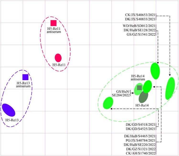
Figure 5.
Antigenic cartography of H5N1 viruses. The antigenic map was generated by using the HI assay data shown in Table S4. Each unit in the coordinate represents a 2-fold difference in HI titer. The squares represent the antisera generated from the indicated viruses. The different coloured ovals show the viruses used for antisera generation and the test viruses.

