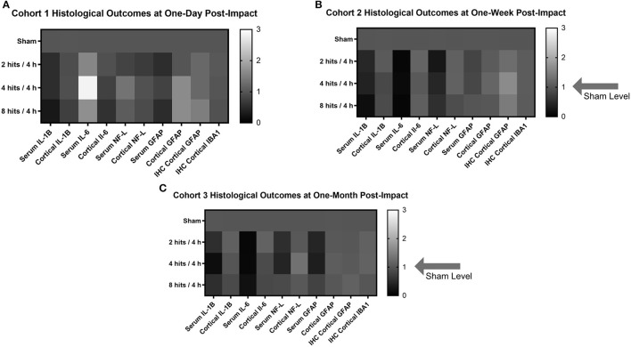
Figure 12.
Heat maps were generated to look at the trends in the biomarker and histological outcomes in each impact group for each cohort. Values were calculated by computing the fold change in each cohort compared to the sham average at the comparable time point for each outcome measure. (A) Histological heat map for Cohort 1 at one-day post-impact. (B) Histological heat map for Cohort 2 at one-week post-impact. (C) Histological heat map for Cohort 3 at one-month post-impact.

