Fig. 7.
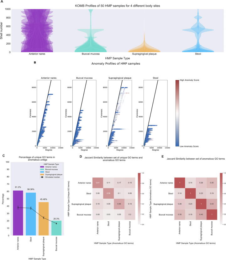
Characterizing community shifts in Human Microbiome Project (HMP) samples. A. KOMB profiles from 4 different body sites containing 50 samples each obtained from HMP datasets. The y-axis of the violin plots represent shell number (cutoff at 1000 for visualization) and the width represents the number of unitigs in each shell. B. Anomaly profiles for each body site (50 samples overlaid), x-axis represents the degree of unitigs and y-axis represents the coreness (or shell number) of the unitigs. The gradient on the color bar represents the CORE-A anomaly score with the white and red representing higher scores within the samples. C. Bar plot showing the percentage of unique GO terms from the set of unitigs marked as anomalous. Black dots represent median of 100,000 random split simulations of GO terms obtained per body site, the whiskers represent (top) and (bottom) percentile indicating significance of the bar plot. D. Jaccard similarity between the set of unique GO term (y-axis) and the entire set of GO terms from the unitig marked as anomalous for each pair of body sites. E. Jaccard similarity between the entire set of anomalous GO terms for each pair of body sites.

