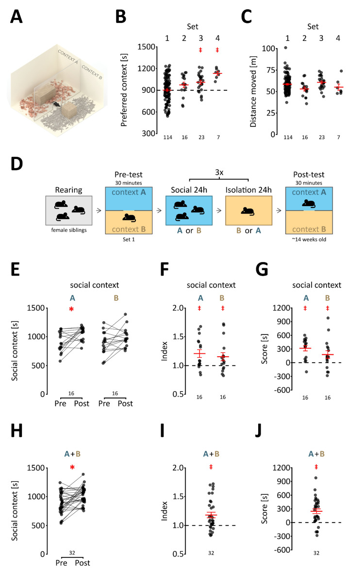
Figure 1.
Social reward in adult mice. (A) A schematic representation of the conditioning cage. The cage was a 30 × 30 × 30-cm cube. The partition is a transparent Plexiglas plate with an opening at the base that allows the animal to cross freely. (B) Inherent preference of conditioning contexts. Each point represents the time spent in the preferred compartment (i.e., having greater average preference) by a single animal. The total time of the test was 1800 s (30 min), and the dashed line represents equal time spent in both compartments (900 s). The sets of bedding used for conditioning are indicated above the graph, complete information on bedding types is provided in Supplementary Tables S1 and S4. The numbers of animals tested in each set are shown below the graph. The mean and s.e.m. are shown in red, and significant preference is marked with a red “‡” (p < 0.05, one-sample t test vs. 900 s). (C) Distance traveled. The graph shows the distance traveled by each animal during the 30-min test. Sets are indicated above, and the group sizes are shown below the graph. The mean and s.e.m. values are shown in red. (D) Schematic representation of the conditioning procedure. The bedding sets are listed in supplementary Table S1. (E) Time spent in context associated with social interaction during the pre- and post-test. For each animal, the times spent in the social context during the pre- and post-tests are joined by a line. A significant increase from the pre- to post-test is marked with a red “*” (p < 0.05, Bonferroni corrected t test). Group sizes are indicated below the graph. (F) Preference index. The values represent the ratio between the time spent in the social context during the post-test to the corresponding time during the pre-test. Group sizes are shown below the graph, and the mean and s.e.m. values are shown in red. A significantly greater than 1 mean index value is shown as a red “‡” (p < 0.05, one-sample t test vs. 1). (G) Preference score. The values represent the difference in time spent in the social context and isolation context during the post-test. Group sizes are shown below the graph, and the mean and s.e.m. values are shown in red. A significant mean preference score is shown as a red “‡” (p < 0.05, one-sample t test vs. 0). (H–J) The change in time spent in the first context between pre- and post-test, the index and the score, respectively, data pooled for contexts A and B. The mean and s.e.m. values are shown in red, where appropriate. Significant effects are shown with a red “*” or “‡” (p < 0.05, two- or one-sample t test, respectively).

