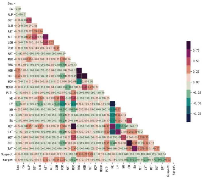
Figure 1.
Correlation coefficient matrix heatmap of all 29 variables. The obtained numerical matrix is visually displayed through a heatmap. Orange indicates a positive correlation, and green indicates a negative correlation. Color depth indicates the value of the coefficient, with deeper colors indicating stronger correlations. Specifically, redder colors indicate correlation coefficients closer to 1, and greener colors indicate coefficients closer to −1.

