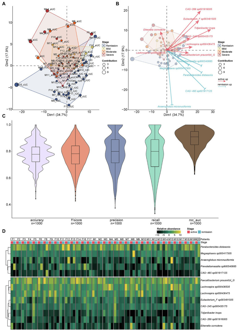
Figure 4.
The PCA analysis of different microbiota and the relative abundance of different microbiota for each sample. (A) Communities cluster using Principal Component Analysis (PCA). Dim1 and Dim2 are plotted on x- and y-axes. Each point corresponds to each sample. The percentage of variation analyzed by the plotted principal components is shown on the axes. Blue, yellow, orange, and red plots indicate the samples in different disease severity of UC, remission, mild, moderate, and severe, respectively. (B) The PCA biplot showed the 13 differential species and their contribution to separation of UC samples. Blue and red arrows indicate the upregulated species in the remission and active stage of UC, respectively. The direction and length of the arrow indicate the difference and the contribution of identification ability of different stages by 13 species above. (C) The results of 1,000 prediction simulation. The average accuracy, f1score, precision, recall, and ROC-AUC are 0.79, 0.78, 0.80, 0.78, and 0.90, respectively. (D) The heatmap showed the relative abundance of different microbiota at the species level for each sample.

