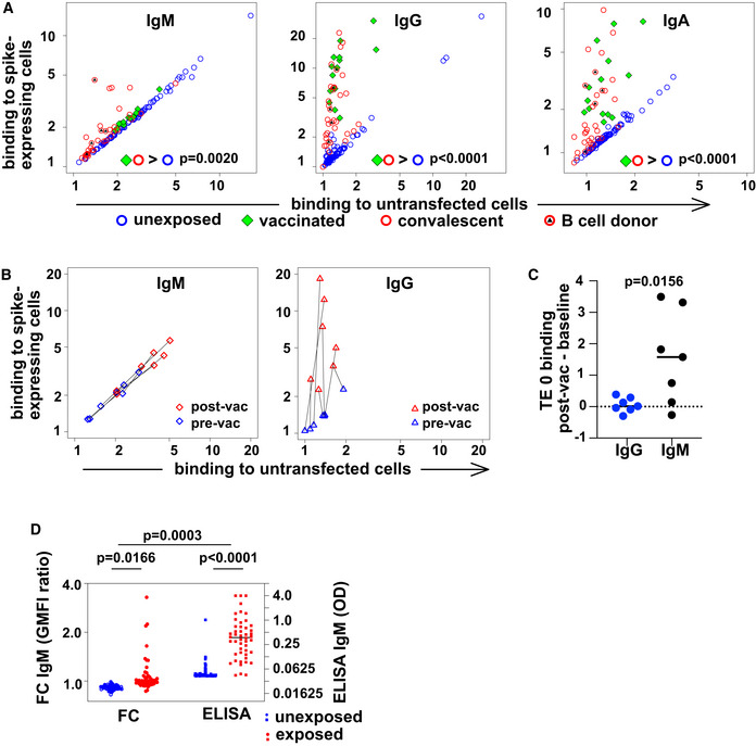
Figure 1. Spike‐protein specific antibodies of classes M, G, and A in human serum.

- Spike‐binding antibodies in serum. Binding by antibodies of classes M, G, and A is detected with secondary antibodies conjugated to different fluorochromes, and the results are shown on the left, middle, and right plots, respectively. Binding (geometric mean fluorescence intensity—GMFI—of corresponding secondary antibody) to TE cells expressing SARS‐CoV‐2 spike protein is plotted on the vertical axis, and binding to untransfected cells on the horizontal axis. Each point represents a value from one donor. Samples from donors with no known exposure to SARS‐CoV‐2 antigens (n = 86) are plotted with blue circles, recently infected donors (n = 34) with red circles, and vaccinated donors (n = 14) with green diamonds. Red circles with black triangles correspond to donors from whose B cells monoclonal antibodies were isolated (n = 5, Appendix Table S2). P values are derived from a two‐way analysis of variance followed by Tukey's test to compare the specific binding, that is (binding to spike‐expressing cells)/(binding to untransfected cells) between conditions (convalescent or vaccinated against unexposed) within each antibody class. The experiment was independently repeated three times, and results shown come from the third replicate.
- Change in antibody binding following vaccination against SARS‐CoV‐2. Binding of antibodies from sera assessed in the experiment shown in (A) is shown for two samples of serum from each of 7 donors. Data are plotted as in (A) with binding to spike‐expressing cells on the vertical axis, and to untransfected cells on the horizontal, using blue symbols for samples from before vaccination, and red symbols for samples from 15 to 29 days after the first vaccination (but before any second vaccination). Black lines connect points corresponding to pre/post pairs of samples from each donor. Left plot shows results for IgM and right plot for IgG.
- Comparison of post‐vaccination increase in binding to untransfected cells between IgG and IgM. The increase in binding to untransfected TE 0 cells between pre‐ and post‐vaccination samples is shown on the left with blue symbols for IgG and on the right with black symbols for IgM. The horizontal line at y = 0 is the expected result when no increased binding is observed. P value is derived from a two‐tailed, Wilcoxon matched pairs signed rank test.
- Comparison of spike‐specific IgM, as measured by flow cytometry or ELISA. The left two “FC” are the results of flow cytometry, and the left vertical axis shows the ratio of serum IgM binding to spike‐expressing cells, vs binding to non‐expressing control cells, as plotted in A. The right two columns show spike‐RBD‐specific IgM as measured by an IgM‐capture ELISA, and the right vertical axis shows the optical densities (OD). P values are calculated by two‐way analysis of variance, followed by Sidak's multiple comparisons test. The entire experiment was repeated three times, and the data shown are derived from the third replicate.
