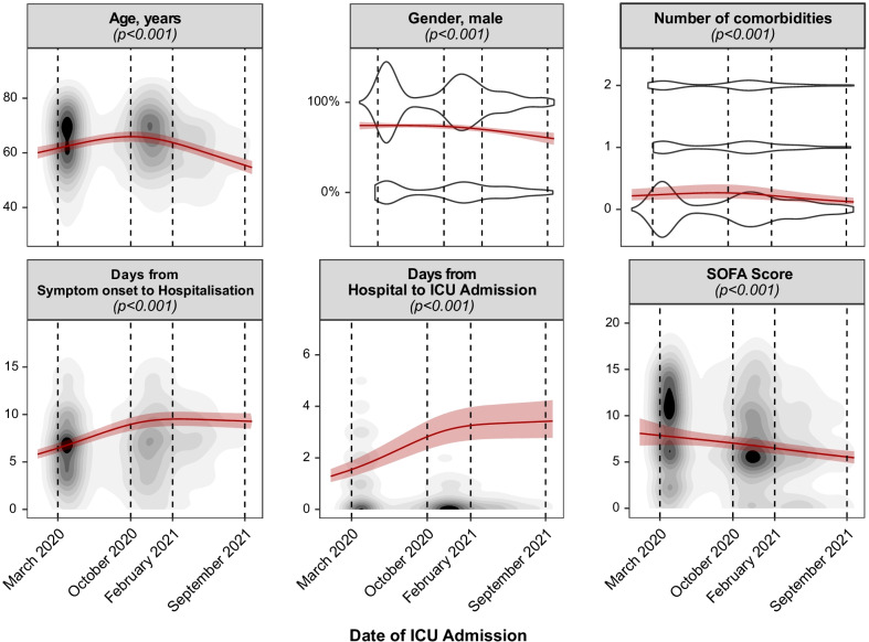
Fig. 1.
Dynamics of baseline characteristics over the pandemic. Mean effects over the time course of the pandemic, calculated by means of generalized mixed-effect models, are depicted by a red continuous line. 95% confidence intervals of the effect are depicted as shaded red area. The given p values originate from an analysis of deviance. Continuous variables are represented by topographic density plots, in which the intensity of the grayscale colouring indicates the highest concentration of values. Categorical variables are represented by violin plots, in which the segmental width of the plot correlates with the concentration of values

