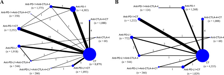
Figure 2.
Network map of comparisons based on different treatments in grade 1–5 adverse events (A) and grade 1–5 immune–related adverse events (B). Each circular node represents a type of treatment. The node size is proportional to the total number of patients administering a treatment (in parentheses). Each line represents a type of head–to–head comparison. The width of lines is proportional to the total number of studies comparing the connected treatments. CT: chemotherapy; PD–1: programmed death–1 receptor inhibitor; PD–L1: programmed death ligand–1 inhibitor; CTLA–4: cytotoxic T lymphocyte associated antigen inhibitor; n: number.

