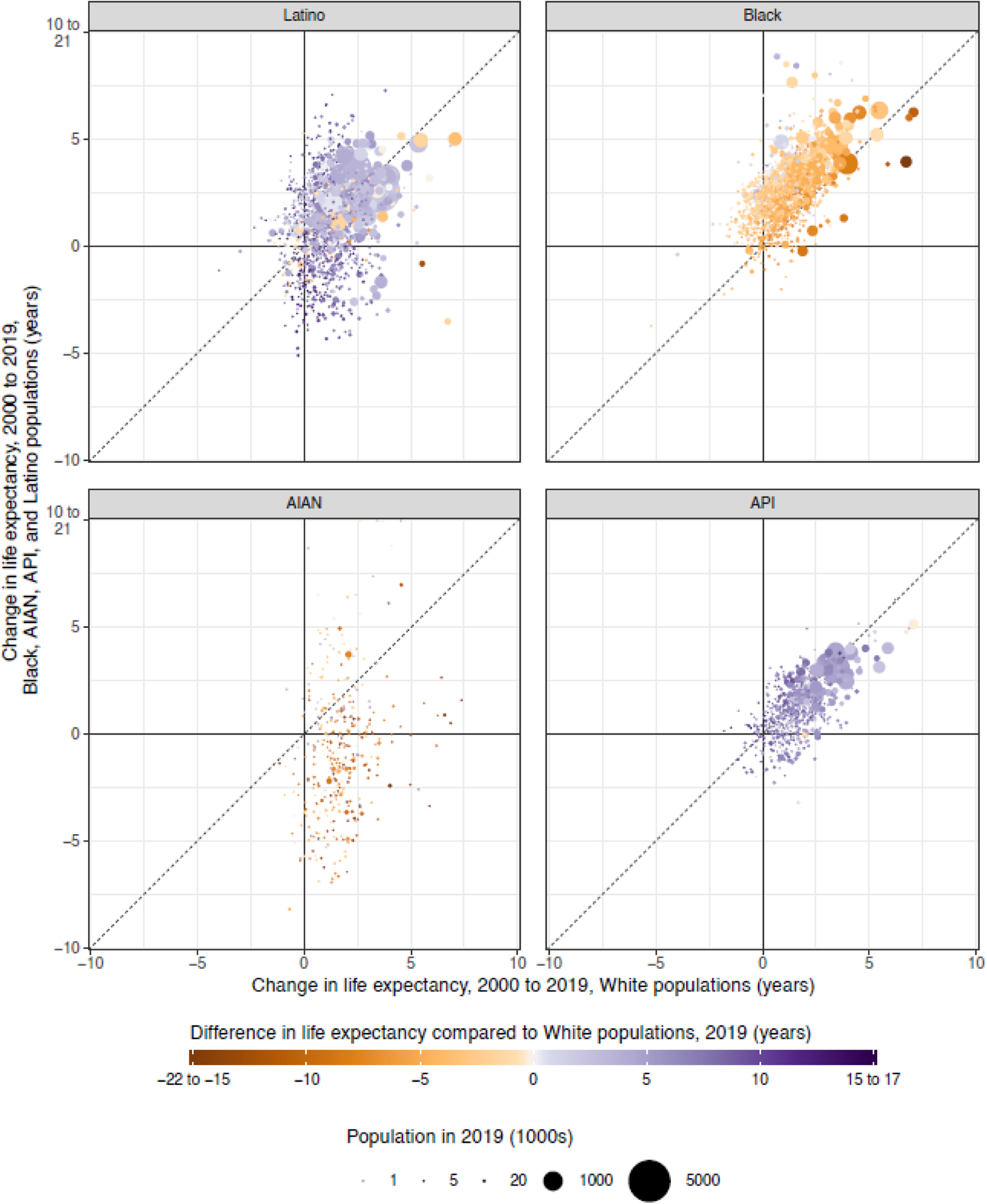
Figure 5: Change in county life expectancy by racial/ethnic group compared to the White population, 2000–2019.

Absolute change in county life expectancy at birth from 2000 to 2019 for each racial/ethnic group compared to this same change for the White population in the same county. Each point corresponds to a county. The colour of each point indicates the difference in life expectancy in this county in 2019 between the racial/ethnic group specified in the panel title and the White population, and the size of the point indicates the population in this county in 2019 for the racial/ethnic group specified. The axes are truncated at −10 and 10 years, as indicated by the axis labels, and the colour scale is truncated at – 15 and 15 years, as indicated by the ranges in the legend. Estimates of life expectancy in county-racial/ethnic group combinations with an average annual population less than 1000 people and/or estimates with an uncertainty interval width greater than ten years are not displayed.
