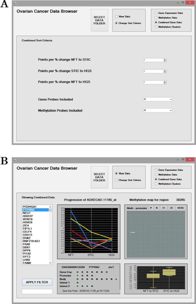
Fig. 3.
The Combined Sort criteria for mining the Combined Gene Data (a). Options are available to filter probe results to prioritise a disease stage using the “Points per % change” and a disease “Direction of Progression” as expression/methylation increasing, decreasing or either. Results can be further filtered to include/exclude Gene Probes and Methylation probes based on increasing or decreasing trends in their expression/methylation. The Combined Gene Data interface displaying results for genes based on cumulative scores for all associated probes (b). The ranked genes are presented on the left as a scrollable list. The “Apply Filter” feature can be used to search the ranked list of genes. All of the associated expression and methylation probes included in the scoring for the PTPRN2 gene are displayed in the lower left panel. The “Gene Exp” line displays the expression probes, and other lines display the methylation probes listed based on their genomic location within Promoter, Gene Body and CpG Islands 1, 2 etc. The panel is interactive and each of the probes listed can be selected to examine their results. A probes score is indicated by the intensity of its shading in green or red. A green probe indicates it is positively related to disease progression, and a red one means the probe is negatively related to disease progression. By default, results for the first probe associated “Gene Exp Probe: ADXECAD.11185_at” with a probe score of 19.11234 are initially displayed. Probes listed with a zero score in parenthesis will have been excluded from the combined score based on the Sort Criteria. Expression/methylation trends in relation to Progression across disease stages are displayed for patients as line graphs. In the upper right panel, an interactive methylation map is provided for the region. This map illustrates the gene’s promotor initially followed by 2,000 genomic positions arranged as 40 consecutive rows of 50 positions each and the methylated positions are shaded green. The percentage change in methylation between disease stages NFT to STIC and STIC to HGSC are also displayed. Specific probes can be explored further individually using the Gene Expression Data and Methylation Data screens. The “UCSC” button can be selected to visualise the genomic region for the CpG probe of interest utilising the online UCSC Genome browser. (For interpretation of the references to colour in this figure legend, the reader is referred to the web version of this article.)

