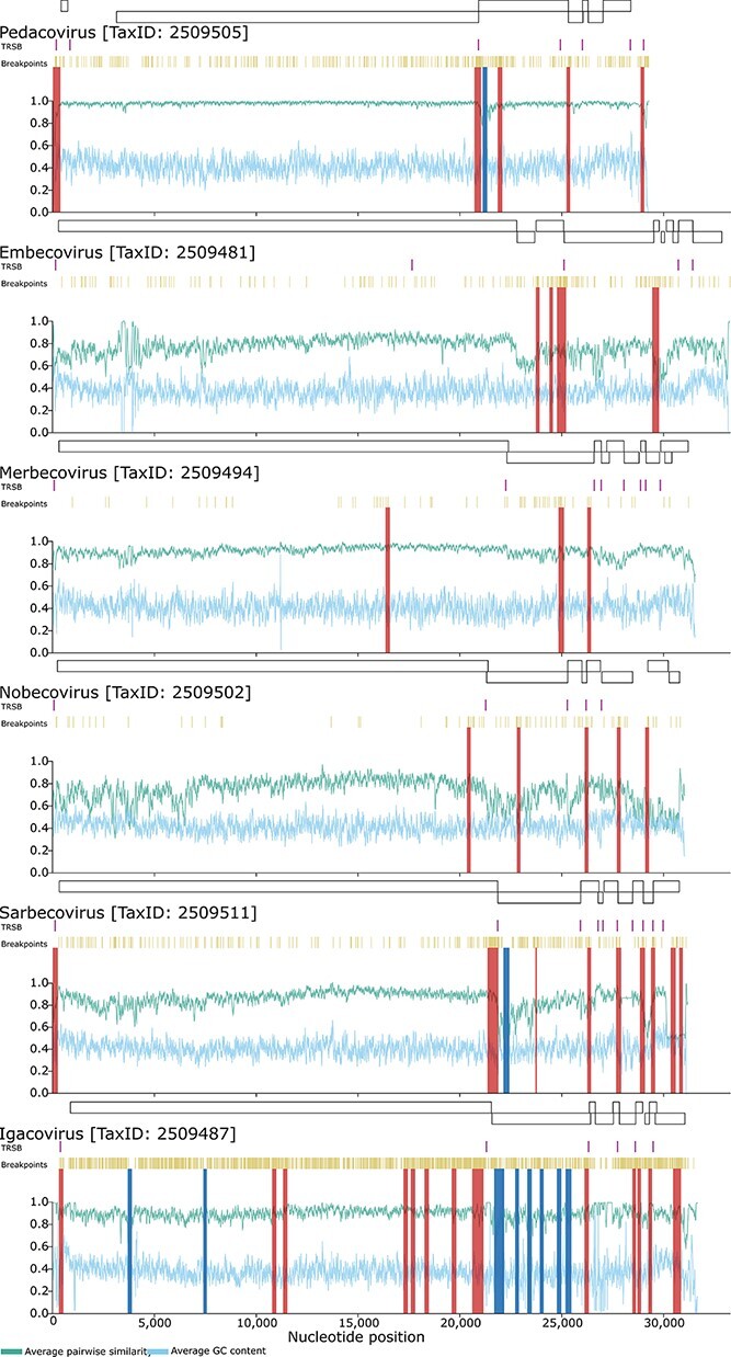
Figure 3.

Regional variations in average pairwise sequence similarity (green/ top x-axis parameter) and GC content (blue/ bottom horizontal X-axis parameter) across coronavirus genomes. The plotted values indicate the pairwise sequence similarity and GC proportions within a moving 40-nucleotide window. Also indicated are the locations of the main genes (above each graph), transcriptional regulatory sequences (TRDs; in purple/ top stripes beneath gene boxes), identified break-point locations (in mustard/ beneath TRSB locations), potential recombination hotspots (in red/ Y-axis bright stripes through graphs) and potential recombination cold-spots (in blue/ Y-axis cold stripes through graphs).
