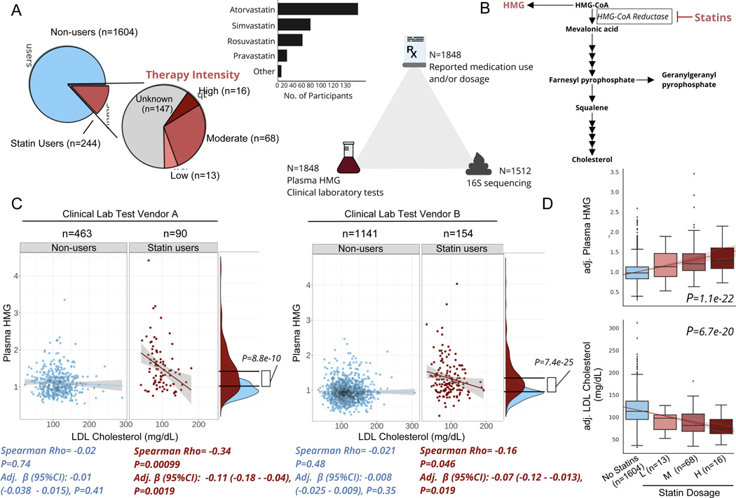
Figure 1. Plasma HMG correlates with statin use and statin-associated LDL-response.
A) Frequency of statin use, type of statin taken, and number of participants with available data for each ‘omics for each participant included in the present analysis. B) Diagram of de novo cholesterol synthesis pathway, with HMG and the rate-limiting enzyme inhibited by statins highlighted. C) Scatterplots of LDL-cholesterol and plasma HMG in statin non-users (blue) and users (red) separately, across two different clinical laboratory test vendors used in the cohort. The lines shown are the y~x regression lines, and the shaded regions are 95% confidence intervals for the slope of each line. Below each scatter plot is the Spearman correlation coefficient and corresponding p-value. Adj. β(95%CI) corresponds to the β-coefficient for LDL cholesterol from GLMs predicting plasma HMG, adjusted for sex, age, and BMI. Also shown to the right of each scatter plot are kernel density plots for plasma HMG in statin users and non- users. The black lines indicate the mean of each group, and the p-value corresponds to the effect size of the difference between statin users and non-users from GLMs adjusted for the same covariates as above. D) Relationship between statin intensity therapy and plasma HMG as well LDL cholesterol levels for the subset of participants in the cohort who had available dosage intensity data (n=97) combined across both clinical lab test vendors. The lines shown are the y~x regression lines, and the shaded regions are 95% confidence intervals for the slope of each line. P-value corresponds to the dose-response relationship between therapy intensity and either plasma HMG (top box plot) or LDL cholesterol (bottom box plot). Values on the y-axis are analyte levels (residuals) adjusted for covariates (sex, age, BMI and clinical lab test vendor). Box plots represent the interquartile range (25th to 75th percentile, IQR), with the middle line denoting the median; whiskers span 1.5 × IQR, points beyond this range are shown individually.

