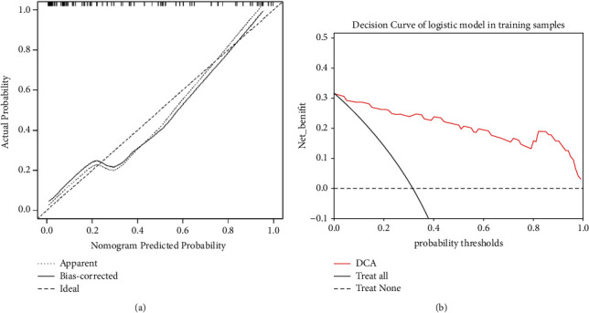
Figure 5.

(a) Calibration curves for nomogram in the training set. The x-axis is the predicted probability of the nomogram; the y-axis is the actual probability of occurrence of PLNM. Perfect prediction corresponds to the “Ideal” line, the “Apparent” line represents the entire cohort (n = 95), and the “Bias-corrected” line represents the performance of the nomogram obtained by bootstrapping (B = 1000 repetitions). (b) The decision curve of nomogram of the model in the training set.
