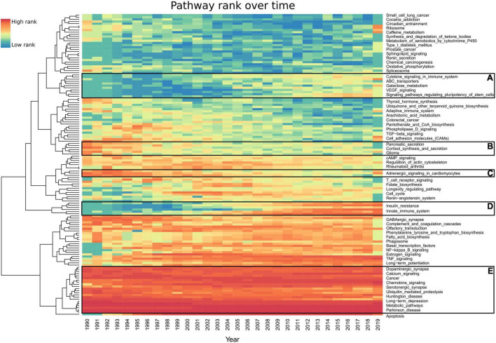
FIGURE 4.
Heatmap representing each pathway’s prevalence over the last 30 years. Each year’s highest ranked pathways are denoted in red, while the lowest rank is denoted in blue. For an improved visualization, we excluded 142 pathways having less than 20 studies per year. AMiner was updated in 2019 so it only captures part of that year. (A,D) Pathways which gained interest. (B,C) Pathways which have lost interest since the 1990s. (E) Pathways which have been consistent in their high scores every year since 1990. Full results can be found in Supplementary Table 6.

