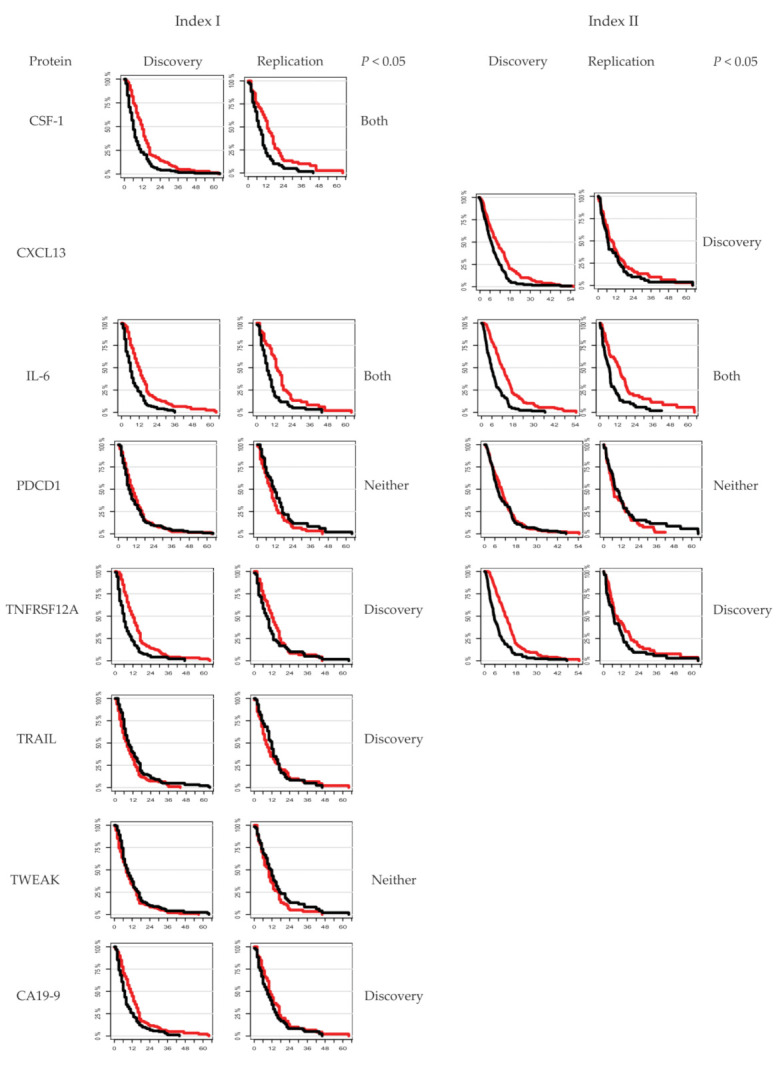
Figure 3.

Kaplan–Meier plots showing each of the proteins included in Index I and Index II, and the individual relation to survival. Red curves illustrate <median protein levels, and black curves illustrate >median protein levels.

Kaplan–Meier plots showing each of the proteins included in Index I and Index II, and the individual relation to survival. Red curves illustrate <median protein levels, and black curves illustrate >median protein levels.