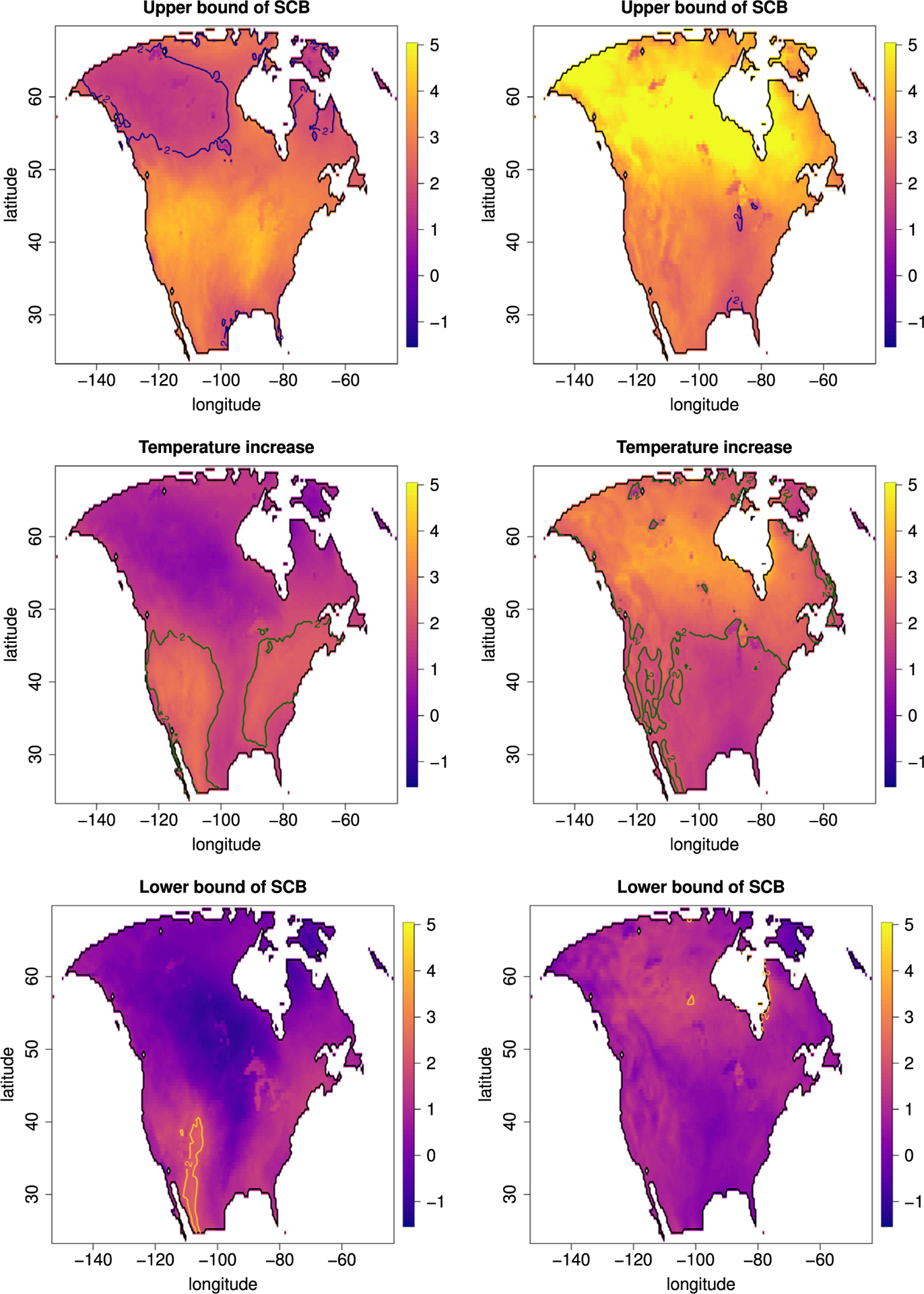
Fig. 9.

Visualization of the difference of mean temperatures in summer (left) and winter (right) of the time periods 2041–2069 and 1971–1999. To visualize regions at risk to experience an increase of more than 2 °C we report in each figure the 2 °C contour line. Top row: upper bound of the SCBs. Middle row: point estimate. Bottom row: lower bound of SCBs.
