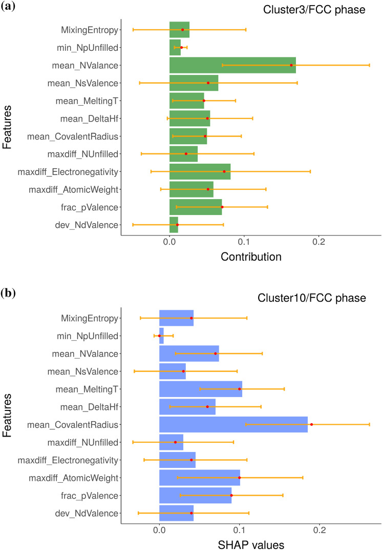
Figure 6.
The (a) BD and (b) SHAP decomposition are plotted for the representative clusters (clusters 3 and 10, respectively), which are predicted to have FCC phase by the eSVM model. The size of each bar indicate the averaged contribution of the respective variables towards the overall prediction for a given instance. Red dots and yellow lines denote median values and error bars, respectively. The y-axis of SHAP plot are sorted in the same way as those of BD plot to facilitate the comparison of two plots.

