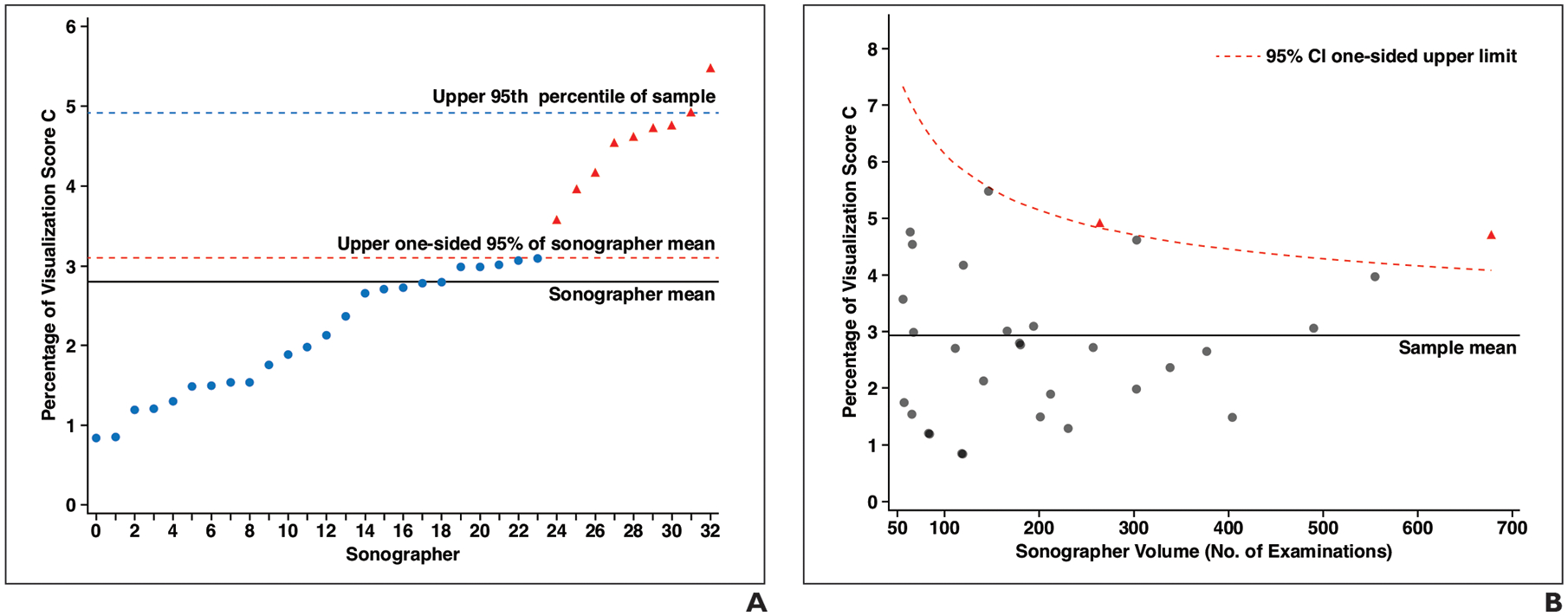
Fig 5—

Graphs of distribution of outpatient examinations with visualization score of C among sonographers who performed 50 or more examinations. Each point corresponds with individual sonographer; those shown as red triangles can be considered outliers among sonographers in terms of higher percentage of visualization score of C according to analytic method used for each plot.
A, Graph shows distribution of percentage of outpatient examinations with visualization score of C by sonographer ordered from lowest to highest percentage. Each x-axis point indicates one of 33 sonographers who performed 50 or more examinations. Solid line indicates mean percentage (2.9%), dashed red line indicates upper one-sided 95% CI of mean, and dashed blue line indicates 95th percentile of sample (3.2%).
B, Graph shows distribution of percentage of outpatient examinations with visualization score of C by sonographer, among sonographers who performed 50 or more examinations, shown as function of sonographer volume. Solid line indicates sonographer mean percentage (2.9%). Dashed red curve indicates upper one-sided 95% CI conditional on sonographer volume according to beta distribution.
