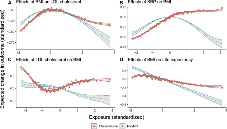
Figure 4.
Most tested causal effects have strong non-linear components in the UK Biobank
The red points show the mean outcome plotted against the median exposure for each of 100 bins, split by covariate-adjusted exposure level. The red curve (solid) is the multivariable regression model, whereas the teal one (dashed) corresponds to the estimated causal function obtained using PolyMR. The hulls around both curves correspond to the 95% confidence interval. (A–D) Four trait pairs: (A) BMI on LDL cholesterol, (B) SBP on BMI, (C) LDL cholesterol on BMI, and (D) BMI on life expectancy.

