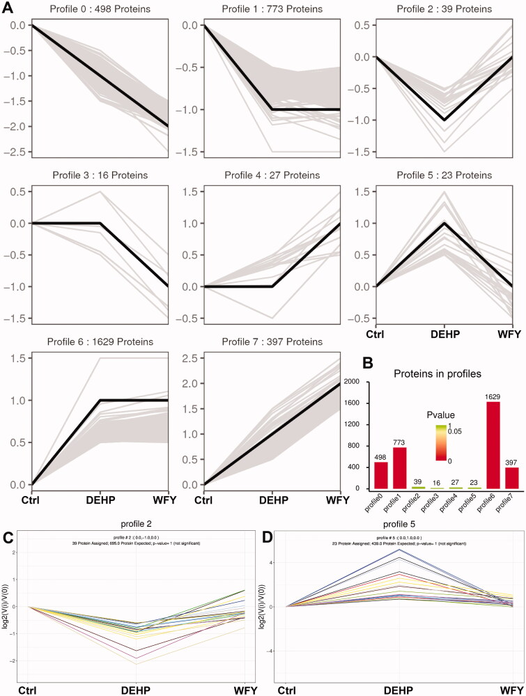
Figure 9.
Trend analysis of DEPs. (A) Trend pattern diagram showing the trend normalization of the protein data. The black line represents the trend line, and the grey line represents each protein. (B) Histogram of trend protein number and p value. The height of the column represents the number of proteins, and the colour of the column represents the p value. (C, D) Trend charts for profiles 2 and 5. Each line in the figure represents a protein. The abscissa is the number of samples, and the ordinate is log2(V(i)/V(0)). The log2 value of the ratio of the expression amount of the (i) sample to the expression amount of the first sample.

