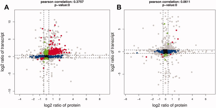
Figure 13.
Nine quadrant diagrams. The horizontal axis is the multiple of protein difference (log2), the vertical axis is the multiple of transcriptome difference (log2), and the top of the graph is the correlation coefficient and p value of the association between transcriptome and proteome. Each dot represents a gene/protein, black dots represent nondifferentiated proteins and genes, red dots represent consistent or opposite trends, green dots represent differentially expressed genes but non-differentially expressed proteins, and blue dots represent differentially expressed genes but differentially expressed proteins (if the difference multiple is reached, but the p value is not, it is shown as a grey point).

