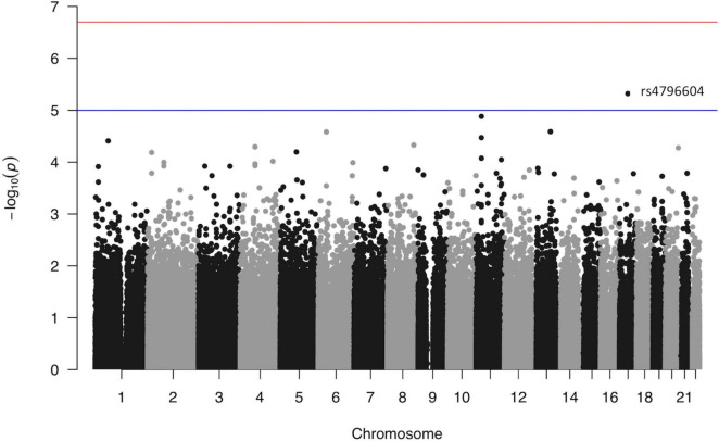
FIGURE 2.
Manhattan plot from the linear regression analysis of the GWAS versus log10(NFR thresholds). Each point represents one single nucleotide polymorphism ordered according to its genomic position (x axis). The y axis reflects the probability value [expressed as −log10(value)] obtained from the logistic regression analysis of each individual SNP in the study. The red line marks the genome-wide association p-value threshold level (2E−07). The blue line marks an arbitrary level set at 1E−05.

