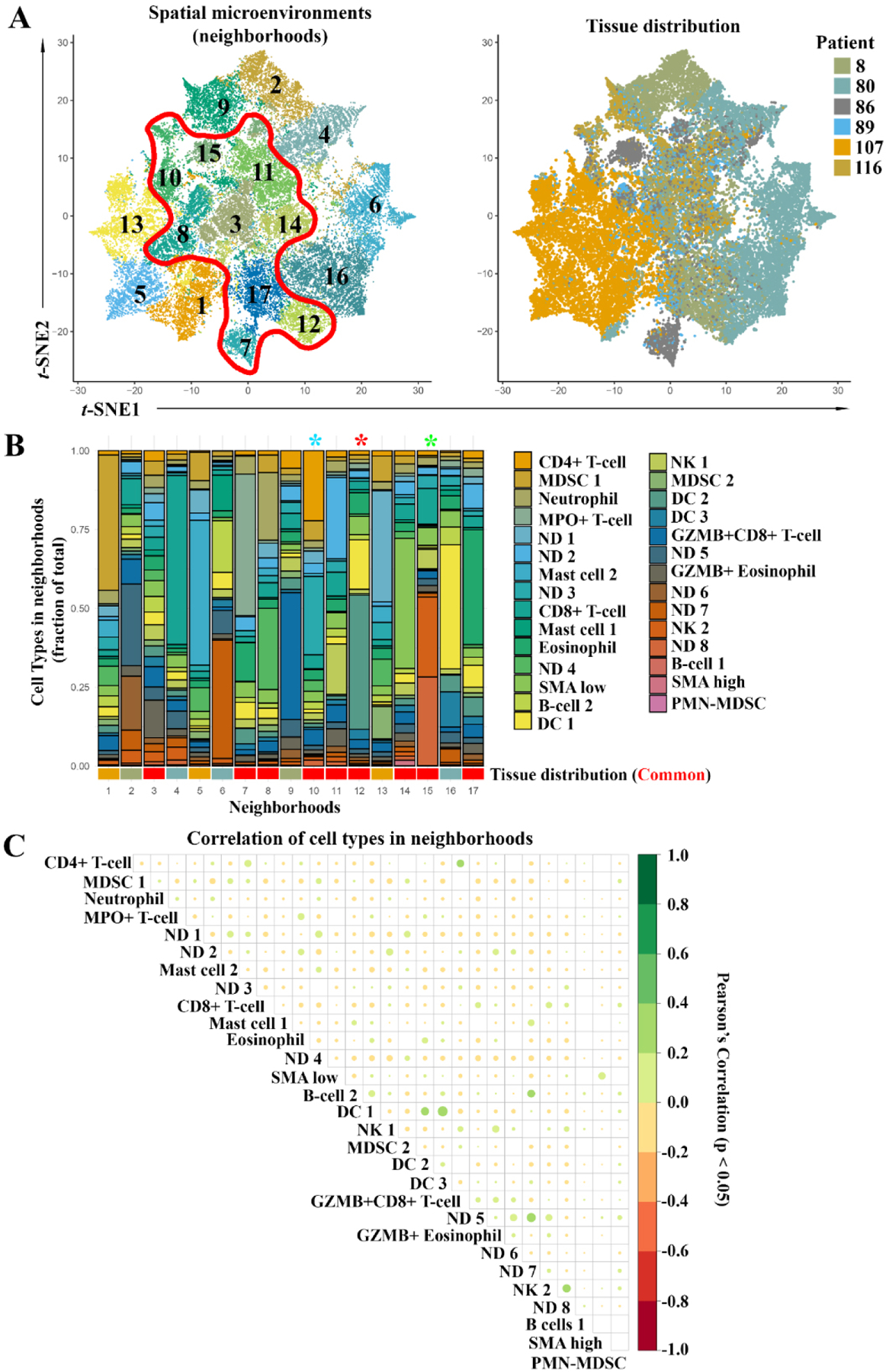
Fig. 5.

Neighborhood analysis of all samples. A) t-SNE plot of spatial microenvironments (neighborhoods) and tissue distribution of neighborhoods between samples. Neighborhoods were classified by the distribution of cell types identified in Fig. 4. Red outline shows neighborhoods consistently recovered through all samples. B) Stacked bar plot of the cellular makeup of all neighborhoods. Approximate tissue distribution (bottom) from Supplemental Fig. 2, red indicates common neighborhoods. * indicates neighborhoods of future downstream focus. C) Correlation matrix of relationship between all cells in neighborhoods. Size and color indicate the Pearson’s correlation coefficient, positive (green), and negative (red) correlations are shown. Significant correlation (p < 0.05).
