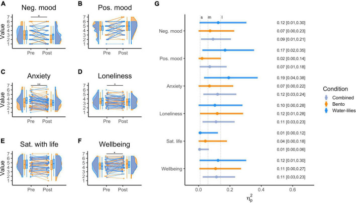
FIGURE 3.
(A–F) Raincloud plots showing the distributions of rating pre and post online cultural experience grouped by condition. The boxplots display the median (horizontal line middle of box), the data within the 25th and the 75th percentile (inside box), and the data within the 10th to the 25th and the 75th to the 90th percentile (vertical line); Dots represent individual ratings; Slopes represent changes between pre and post. Images were computed following Langen’s tutorial (Allen et al., 2021; see https://github.com/jorvlan/raincloudplots); (G) forest plot of the effect sizes (partial eta square) of the online experience on the six DVs. Vertical dashed lines are used to indicate intervals to interpret the strength of the effect. S, M, L indicate small, medium, and large effect size intervals.

