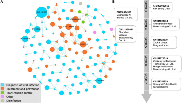
FIGURE 4.
Network visualization map of citations by COVID-19 patents. (A) Citation network illustrating the evidence sources cited in 117 recommendation patent documents. The larger the circle is, the more frequently the patents received citations. Lines represent the citation direction. The force-directed layout algorithm of “Fruchterman Reingold” by Gephi is used to make the network distribution. Different circle colors indicate different technologies. (B) The main path from the typical key-route citation weighted with the top 10 patents of citation out-degree. In the visual analysis of the main path based on patent citation, time was added to the technology trajectory calculated by Gephi software, which clearly shows the research focus and direction of this field in different time periods.

