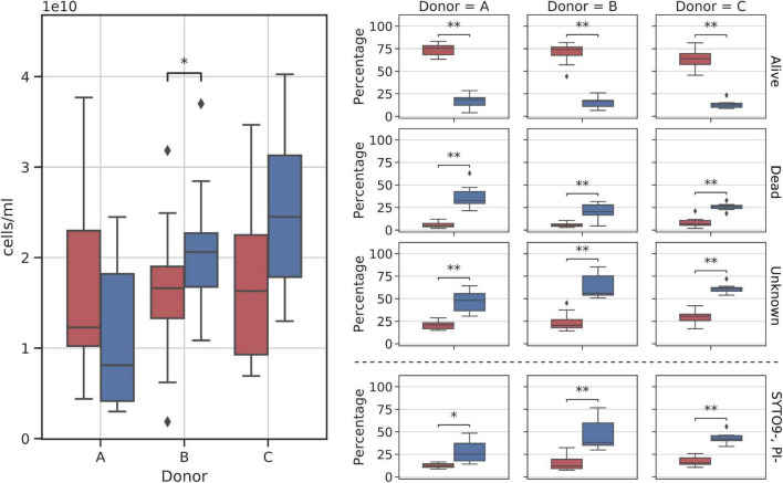
FIGURE 6.
Diagram comparing flow cytometry cell counts and group fractions obtained for fresh and frozen suspensions. The (left panel) shows the total donor cell counts comparison. The (right panel) shows changes in each of the inspected flow cytometry groups (alive, dead, unknown, and SYTO9–, PI– subgroups). Red—fresh samples; blue—frozen samples; * – p < 0.05; ** – p < 0.01.

