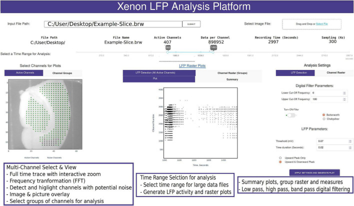
FIGURE 2.
Snapshot of the analysis GUI features. A view of the analysis GUI which is rendered in an html browser built in Python using Plotly’s Dash. The GUI has several interactive features from individual and group channel selection, low-pass, high-pass, and band-pass filtering, viewing entire trace or a small section of the trace, Fast Fourier Transformation (FFT) of sections from selected traces, customized raster plots, small groups of channels, and generation of group summary measures.

