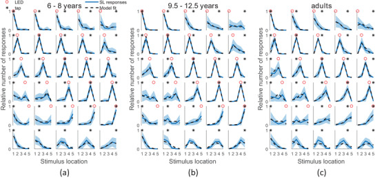
FIGURE 3.

Average response distributions for the different conditions, per age group. Columns correspond to different tactile stimulus locations, rows to different visual stimulus locations. Per condition, the fraction of responses for each location are averaged over participants, shaded regions indicate standard errors. Dotted lines display model predictions, based on a group‐level MCMC fit of the model averaging causal inference model. Different panels correspond to different age groups: (a) 6‐ to 8‐year‐olds, (b) 9.5‐ to 12.5‐year‐olds and (c) adults. Node 1 was the most proximal (close to the elbow), node 5 the most distal
