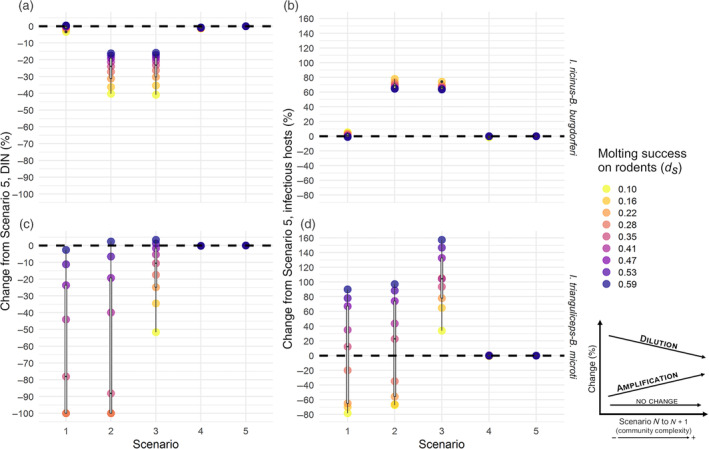
FIGURE 2.

Percentage of change from Scenario 5 in (a, b) density of infectious nymphs (DIN) and (c, d) infectious hosts across the five scenarios (on the x‐axis) and the range of molting success on rodents (d s ) (colored circles) in the two pathosystems: Ixodes ricinus–Babesia burgdorferi (top) and I. trianguliceps–B. microti (bottom). Black dashed line, no change. Box and whisker plots on top of colored circles represent the percentage of change distribution across the range of d s values. Lower and upper box boundaries are 25th and 75th percentiles, respectively, line inside box is the median, lower and upper error lines are 10th and 90th percentiles, respectively, filled circles show data falling outside 10th and 90th percentiles. Decrease of percentage of change from less complex to more complex scenario represents dilution, while increase represent amplification. Other parameter values are listed in Table 2
