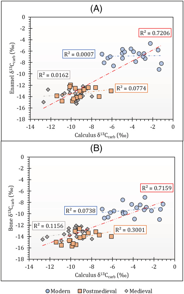
FIGURE 3.

Graphs showing δ13C correlations between (A) calculus carbonate and enamel carbonate and (B) calculus carbonate and bone carbonate for separate modern, medieval and post‐medieval population groups. Each trendline is coded according to the symbol colour for each population and the red trendline represents the collective dataset in each graph. Contains isotope data, produced by the British Geological Survey, UKRI [Color figure can be viewed at wileyonlinelibrary.com]
