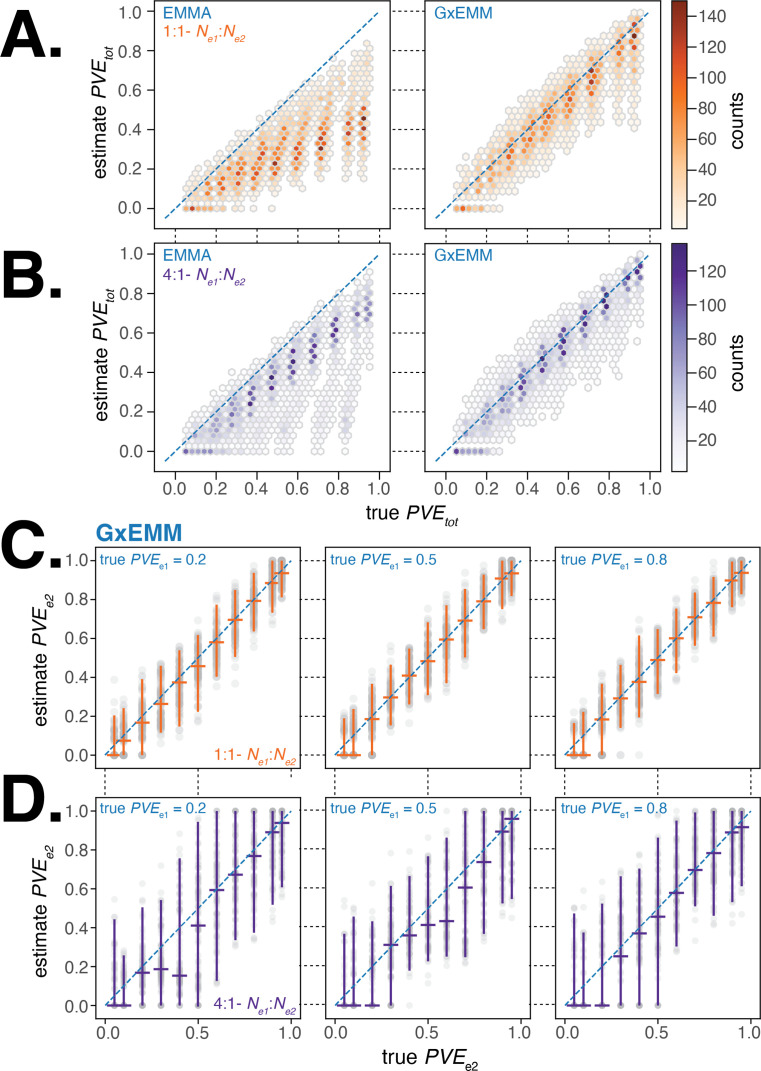
Figure 3. Evaluating gene–environment mixed mode (G×EMM) and EMMA using simulated datasets.
(A). Comparison of true to that estimated from EMMA (left panel) and G×EMM (right panel). Simulations were run with an equal number of samples in each environment () and with the same value for the environment-specific error terms (). (B). Same as (A) but with a 4:1 ratio of samples between environments (). (C). Plot of the true vs. the G×EMM estimate of . Gray points are the results of individual simulations, orange lines denote the median and 95% interquartile range (IQR). The three panels differ in the true proportion of phenotypic variance explained by genetics (PVE) specific to environment 1, . Simulations were run with an equal number of samples in each environment () and with the same value for the environment-specific error terms (). (D). Same as (C) but with a 4:1 ratio of samples between environments ().

