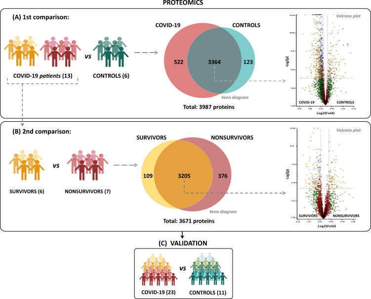
Fig. 1. Experimental design and proteomic results.
A Schematic representation of the experimental setup for platelet proteome screening in COVID-19 patients (COVID-19, survivor, and nonsurvivor groups) compared with healthy volunteers (controls). B Venn diagram representing total, unique, and shared protein identifications among the experimental groups. C Volcano plot of all shared proteins in the comparisons between COVID-19 patients and controls and among survivors and nonsurvivors. Each dot represents a protein mapped according to its log2 (fold change) on the y-axis and its −log2 (t test p value) on the x-axis. The red dots indicate proteins that did not satisfy the fold-change cutoff and p value (0.05). Green dots depict protein entries that met the fold-change cutoff but not the p value. Orange dots indicate proteins that satisfied both fold-change and p value but had low abundance, as determined by an additional stringency filter. Blue dots represent protein entries that met all statistical filters and were selected for further analysis.

