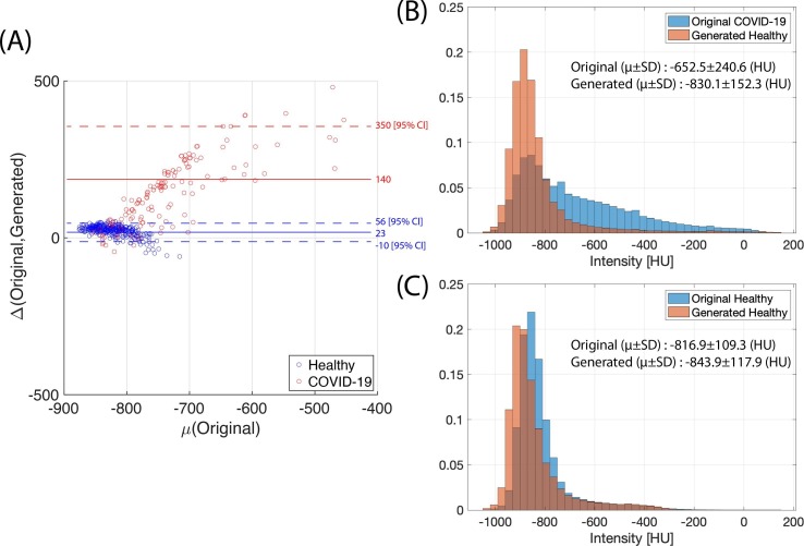
Fig. 4.
(A) Scatter plot of original mean lung attenuation versus difference of means between original COVID-19 and the generated healthy images (Red) and between the original healthy and original healthy run through the COVID-Healthy generator (Blue). Dotted lines represent 95% confidence intervals. (B) Histogram of attenuation including all in-lung voxels of 153 original COVID-19 images and their corresponding generated healthy images. (C) Histogram of attenuation including all in-lung voxels of 356 original healthy images and their corresponding generated images, created by passing original healthy images through the COVID-to-Healthy generator.

