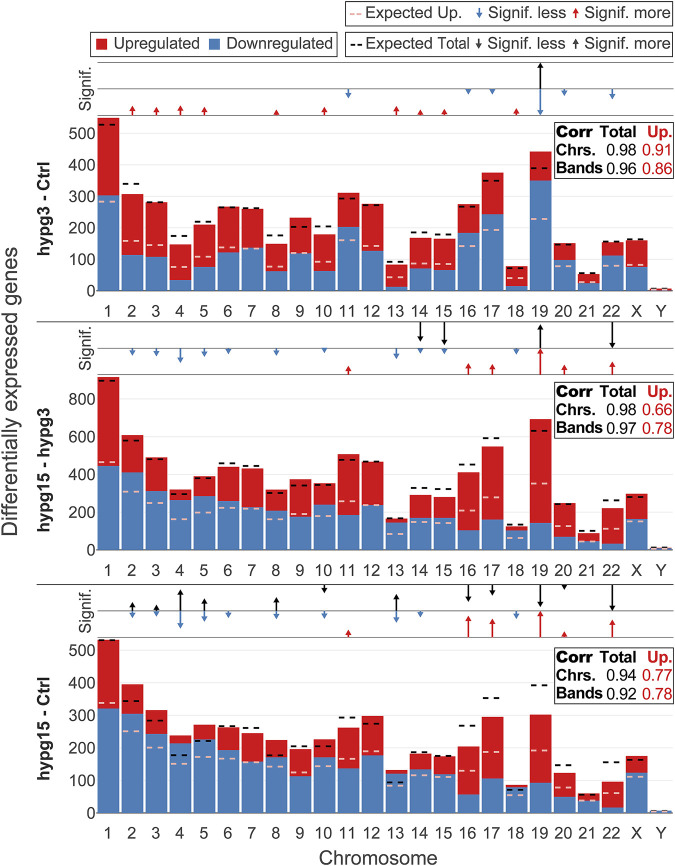
FIGURE 3.
Chromosomal distribution of differential gene expression. Number of differentially upregulated (red) and downregulated (blue) genes per chromosome (horizontal axis) for all three comparisons. The expected number of total DEGs per chromosome (based on the fraction of differentially expressed genes for all genes and the number of detected genes per chromosome and assuming a uniform probability of differential expression) is shown as a black dashed line, the expected number of upregulated genes out of up- and downregulated genes is shown as dashed light red line. Above each diagram, arrows show if the actual number of all DEGs (upper row)/upregulated genes (lower row) lies significantly above (arrow pointing upwards, arrow length represents magnitude of deviation) or below (arrow pointing downwards, arrow length represents magnitude of deviation) the expectation. In the box on the right, the correlation coefficient between the expected and the actual number of total DEGs/upregulated genes is shown, both on the chromosome level (as displayed in the diagram) and on the chromosomal cytoband level. The closer the correlation coefficient comes to 1, the more the actual number corresponds to the expected number. Initially, DEGs were evenly distributed over all chromosomes, tightly following the expectation, but upregulation versus downregulation was non-evenly distributed between chromosomes. Later in time, also absolute numbers no longer corresponded to the expectations. The same figure split by chromosome cytobands can be found in Supplementary Figure S8.

