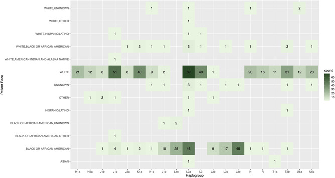
Figure 3.

Distribution of the top 20 haplogroups in the preterm patient cohort by race. Heatmap shows the haplogroup count by race for the 20 most frequently observed haplogroups in the preterm patient cohort. The labels on the left axis represent the various self‐identified ethnic or ancestry groupings, while the labels along the bottom axis represent the 20 most frequently observed mitochondrial genome (mtDNA) haplogroups in the preterm patient cohort. The numbers in black within each square indicate the number of samples where a particular mtDNA haplogroup was detected for a particular racial or ethnic category. Each square is also color‐coded based on the number of samples with that particular combination of mtDNA haplogroup and self‐identified racial category, based on the key on the right side of the heatmap
