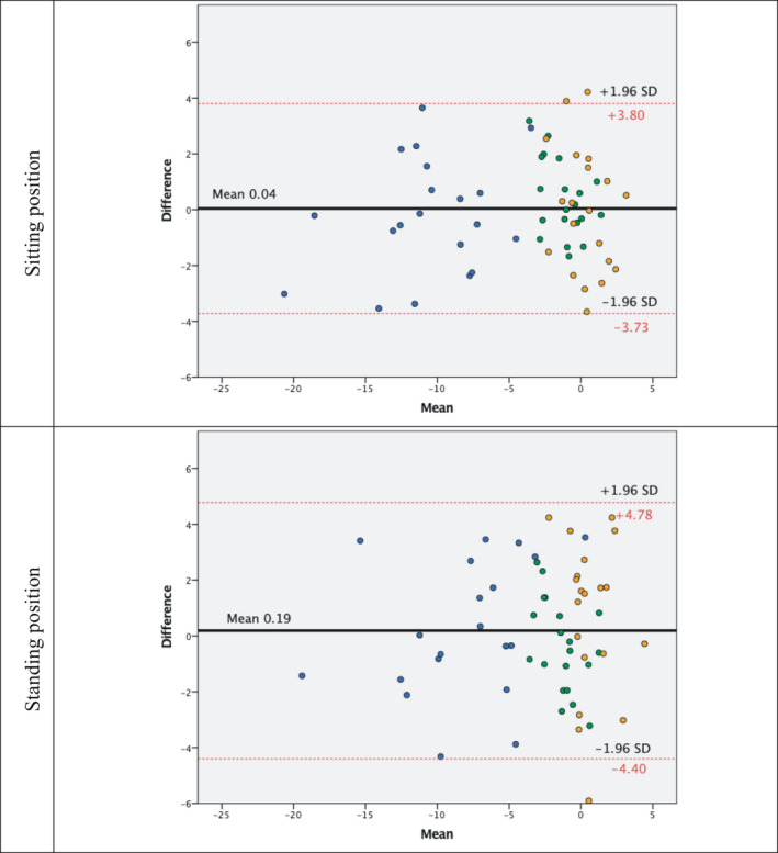
FIGURE 3.

Bland‐Altman plot showing the relationship between the two sessions: The x‐axis represents the mean between the two and the y‐axis the differences. Red lines indicate the 95% confidence interval, and the black line indicates the bias (mean of the differences). Blue points indicate the pitch, while green and orange points indicate the roll and yaw, respectively
