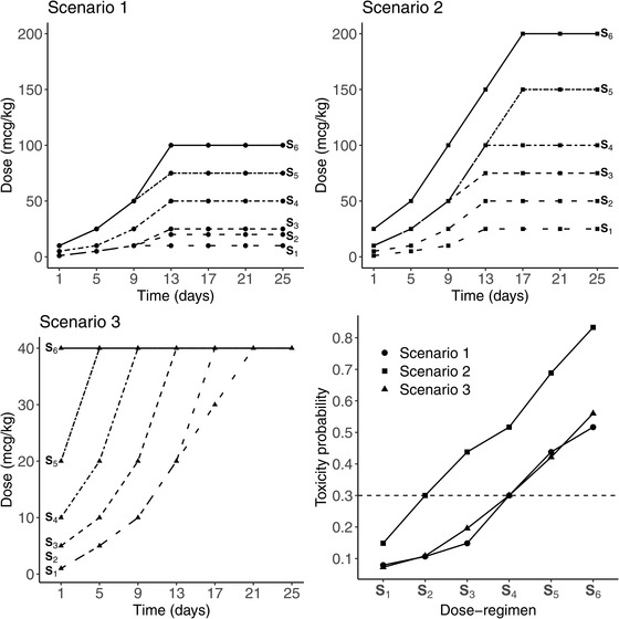
FIGURE 3.

The first three subplots represent the panel of dose regimens from S1 in spaced dashed line to S6 in solid line, for the three main scenarios, where the type of points is specific to each scenario. In the last subplot in the lower right corner, the dose regimen toxicity relationship is represented for each scenario, where the MTD‐regimen is the dose regimen having the toxicity probability the closest to the target , plotted in dashed line
