FIGURE 3.

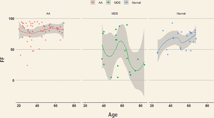
Scatterplots of FF against age for AA, MDS, and control groups. The line represents best‐fit regression trend. The shaded area is CI. The FF values in the AA group were higher than in the MDS and control groups.

Scatterplots of FF against age for AA, MDS, and control groups. The line represents best‐fit regression trend. The shaded area is CI. The FF values in the AA group were higher than in the MDS and control groups.