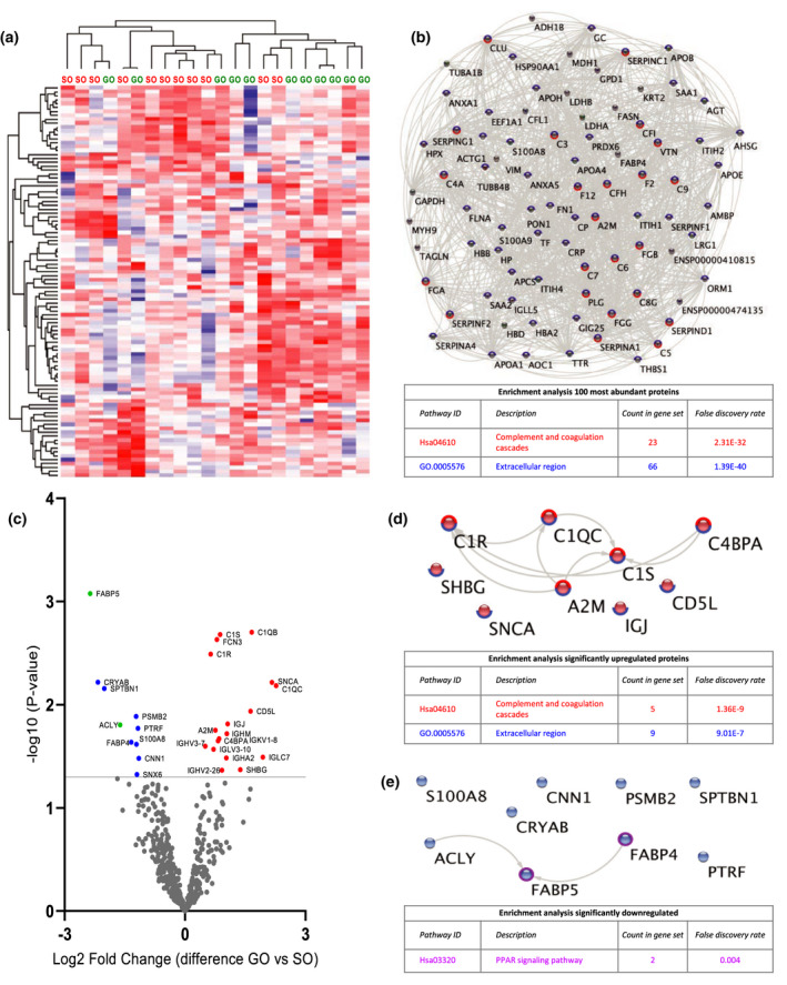
Figure 2.

Quantitative proteomic analysis of perfusate samples after 15 min of HMP (T1). (a) Heat map and hierarchical clustering of 100 most abundant proteins at T1. (b) STRING analysis of 100 most abundant proteins at T1. Nodes circled with blue represent proteins located in extracellular regions (FDR: 1.39E‐40) and red represent functional enrichment of the KEGG complement and coagulation pathway (FDR: 2.31E‐32). (c) Volcano plot showing differential protein expression of 498 identified proteins at T1 between good outcome (GO) and suboptimal outcome (SO) at 1‐year post‐transplantation. X‐axis demonstrates protein level difference indicated by log2 fold change, and Y‐axis demonstrates statistical significance indicated by ‐log10 (P‐value). A ‐log10 (P‐value) of > 1.3, and a fold change of > 0 was considered significant. Blue dots represent significant downregulated proteins. Red dots represent significantly upregulated proteins. Green dots represent proteins identified using prediction models. (d) STRING pathway analysis of significantly upregulated proteins at T1. Nodes circled with blue represent proteins located in extracellular regions (FDR: 9.01E‐7) and red represent functional enrichment of the KEGG complement and coagulation pathway (FDR: 1.36E‐9). (e) STRING analysis of significantly downregulated proteins at T1. Nodes circled with purple represent proteins involved in PPAR signalling (FDR: 0.004). FDR, false discovery rate.
