
FIGURE 2.
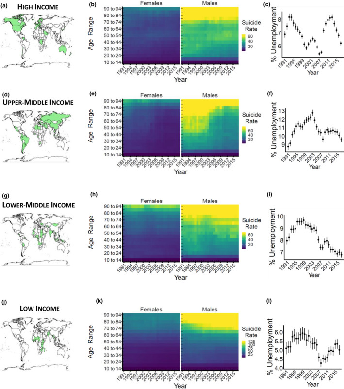
Suicide rates stratified per income classes. (a) high‐income class countries (in 2010, green) considered in our analysis. (b) suicide rates per sex, year (x‐axis), and age range (y‐axis). The labels of the age ranges representing the second half of each decade (15 to 19, 25 to 29, etc.) are omitted for ease of reading. Each tile color refers to median suicide rates per year and age range across the countries considered. Higher rates correspond to the increasing yellow color of the tile. (c) unemployment rate per year (point range = mean and confidence interval). The panels d–l are replicas of the panels described above, for countries of different income classes