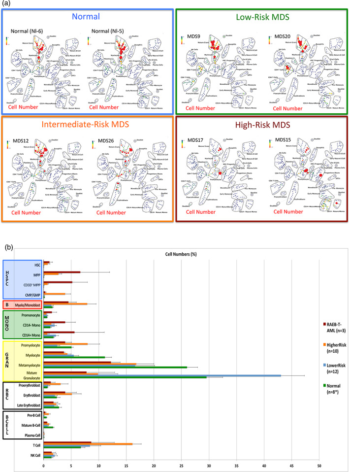
Figure 4.

Distribution of cell frequency across hematopoietic development correlates with MDS risk. (a) SPADE tree colored for the fraction of total cells in each node from lowest (blue) to highest (red). The size of each node is correlated to the fraction of cells mapping to the node; however, a minimum size was enforced for most nodes to allow visualization of node color. (b) The frequency of cells in the indicated (manually gated) stem and progenitor cell compartments for patients of each MDS risk group. Error bars indicate standard errors of the means. Asterisk denotes the eight replicate normal samples came from five donors [Color figure can be viewed at wileyonlinelibrary.com]
