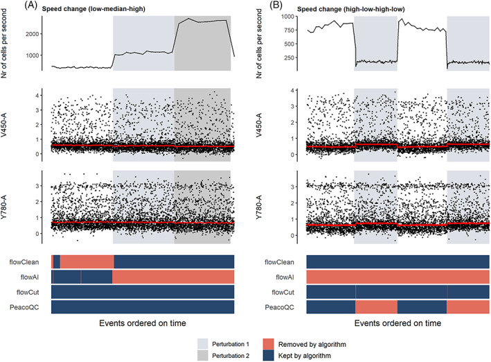
FIGURE 3.

Cleaning of samples where speed changes were introduced. The top figure shows the flow rate of the sample and is followed by two scatterplots where the marker signals measured on channels V450‐a and Y780‐a are displayed. The red lines on these plots are the medians of the marker intensities determined in bins of 1000 events per bin. At the bottom, a heatmap is shown where the events are colored by whether they are removed by one of the four algorithms. (A) In this sample, two speed changes were introduced (from a low to a medium and a high setting) which do not seem to influence the signal intensities. (B) The speed setting was varied from high to low to high to low which did seem to introduce a permanent signal increase or decrease [Color figure can be viewed at wileyonlinelibrary.com]
