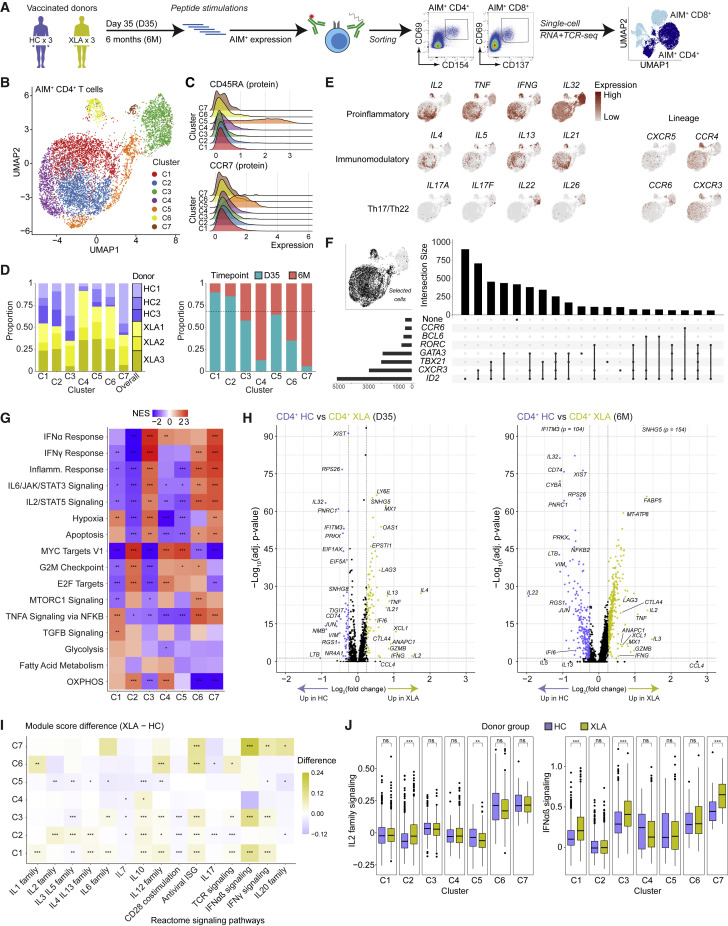
Figure 4.
Single-cell transcriptome landscape of spike-specific CD4+ T cells in HCs and patients with XLA post-mRNA vaccination
(A) Schematic workflow for single-cell sequencing of spike-specific T cells.
(B) UMAP visualization of CD4+ T cell clusters (C1–C7) identified from HC and XLA patients at the day 35 and 6 months.
(C) Ridge plots of CD45RA and CCR7 protein expression across CD4+ T cell clusters.
(D) Bar plots of the composition of each cluster according to donor or time point of origin. The dotted line represents the overall distribution of cells between day 35 and 6 months.
(E) UMAP visualizations colored by gene expression intensity.
(F) UpSet plot of polarizing helper subset marker co-expression.
(G) Heatmap of normalized enrichment scores calculated using GSEA for Hallmark gene sets for each cluster. NES, normalized enrichment score.
(H) Volcano plot of differentially expressed genes between CD4+ T cells from HC and XLA donors at the day 35 and 6-month time points. Genes with very low p values consisting only of sex-chromosome-linked genes were removed for visualization purposes.
(I) Heatmap showing the difference in median module scores between XLA and HC donors across clusters. Curated gene sets were obtained from the Reactome pathway database.
(J) Distribution of module scores for signaling pathways from the Reactome pathway database.
Graphs show median ± IQR (J). (G) GSEA permutation test. (I and J) Mann-Whitney test. (G, H, I, and J) ∗p < 0.05, ∗∗p < 0.01, ∗∗∗p < 0.001, ns, not significant.
See also Figures S4 and S5.

