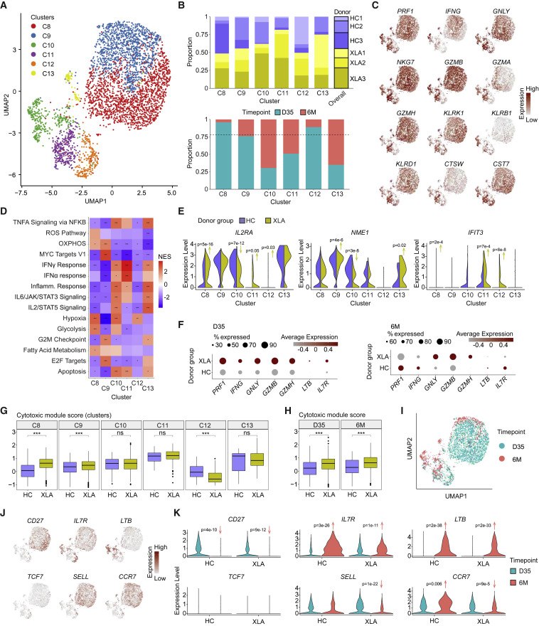
Figure 5.
Single-cell analysis reveals the functional spectrum of spike-specific CD8+ T cell responses in HCs and XLA patients
(A) UMAP visualization of CD8+ T cell clusters (C8–C13) identified from HC and XLA donors at day 35 and 6 months. Day 35.
(B) Bar plots of the composition of each cluster according to donor or time point of origin. The dotted line represents the overall distribution of cells between day 35 and 6 months.
(C) UMAP visualizations for expression of a curated cytotoxic gene signature set colored by gene expression intensity.
(D) Heatmap of normalized enrichment scores calculated using GSEA for Hallmark gene sets for each cluster. NES, normalized enrichment score.
(E) Violin plots of gene expression for markers of activation.
(F) Dot plot of gene expression between all CD8+ T cells from HC and XLA donors at day 35 and 6 months.
(G) Distribution of module scores for a cytotoxic gene signature across clusters.
(H) Distribution of module scores for a cytotoxic gene signature across time points.
(I) UMAP visualization for the time point of origin of cells.
(J) UMAP visualizations for expression of memory gene signatures colored by gene expression intensity.
(K) Violin plots of memory gene signatures split by time point and donor group of origin.
Graphs show median ± IQR (G and H). (D) GSEA permutation test. (E, G, H and K) Mann-Whitney test. (D, G, and H) ∗ p < 0.05, ∗∗ p < 0.01, ∗∗∗ p < 0.001, ns, not significant. See also Figure S5.

