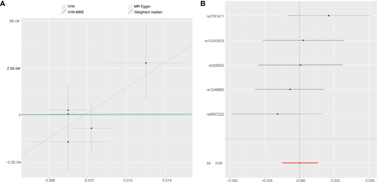
Figure 5.
Forest plot and scatter plot of the association of self-reported vigorous PA with the risk of AS. (A) Scatter plot: each black dot indicates a SNP, plotted by the estimate of SNP on self-reported vigorous PA and the estimate of SNP on the risk of AS with standard error bars. The slopes of the lines correspond to causal estimates using each of the different methods. (B) Forest plot: the dot and bar indicate the causal estimate of self-reported vigorous PA on risk of AS.

