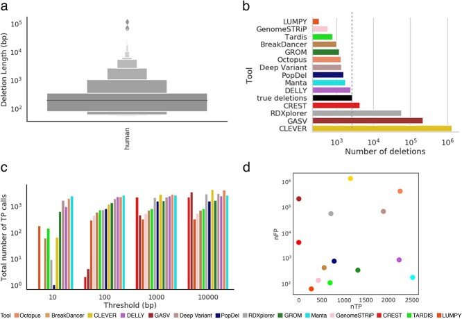
Figure 6.
Comparison of inferred deletions across SV callers on human data. (A) Length distribution of molecularly confirmed deletions from the human whole genome. (B) Number of molecularly confirmed deletions (‘true deletions’ black color) and number of deletions detected by SV callers. (C) Bar plot depicting the total number of TP calls across all error thresholds for each SV caller. (D) Scatter plot depicting the number of correctly detected deletions (TP: true positives) by the number of incorrectly detected deletions (FP: false positives) at the 100 bp threshold.

